Download this page as:
What’s new?
In this tutorial, we’ll introduce:
- matplotlib: a versatile plotting package
- numpy: defining arrays
- scipy.special: special mathematical functions
- itertools: standard library providing common functionality to do iterations
Matplotlib basics
Matplotlib is a python 2-d plotting library which produces publication quality figures in a variety of formats and interactive environments across platforms. Matplotlib can be used in Python scripts, the Python and IPython shell, web application servers, and six graphical user interface toolkits.
Documentation
The matplotlib documentation is extensive and covers all the functionality in detail. The documentation is littered with hundreds of examples showing a plot and the exact source code making the plot:
- Matplotlib pyplot summary: key pyplot plotting commands in a table.
- Thumbnail gallery: hundreds of thumbnails linking to the source code used to make them (find a plot like the one you want to make).
- Code examples: extensive examples showing how to use matplotlib commands.
- Matplotlib manual
Hints on getting from here (an idea) to there (a plot)
- Start with Screenshots section of the manual for a broad idea of the plotting capabilities
- Most of the high-level plotting functions are in the pyplot module and you can find them quickly by searching for pyplot.<function>, e.g. pyplot.errorbar.
Matplotlib and IPython
Matplotlib and IPython work extremely well together. If you start ipython with the option --pylab, all import statements will be done for you and the plots will be generated in a separate thread, so that you can view your plot while working:
$:> ipython --pylab
Otherwise, you can just start the IPython shell the normal way:
$:> ipython
and import the necessary modules explicitly:
In [1]: from matplotlib import pyplot as plt

In [2]: import numpy as np
Plotting 1-d data
The matplotlib tutorial on Pyplot (Copyright (c) 2002-2009 John D. Hunter; All Rights Reserved and license) is an excellent introduction to basic 1-d plotting. The content below has been adapted from the pyplot tutorial source with some changes and the addition of exercises.
matplotlib.pyplot is a collection of command style functions that make matplotlib work like MATLAB. Each pyplot function makes some change to a figure: eg, create a figure, create a plotting area in a figure, plot some lines in a plotting area, decorate the plot with labels, etc.... matplotlib.pyplot is stateful, in that it keeps track of the current figure and plotting area, and the plotting functions are directed to the current axes:
In [3]: plt.figure()          # Make a new figure window
 Out[3]: <matplotlib.figure.Figure at 0x101fb3810>

In [4]: plt.plot([1,2,3,4])
 Out[4]: [<matplotlib.lines.Line2D at 0x1096e3890>]

In [5]: plt.ylabel('some numbers')
 Out[5]: <matplotlib.text.Text at 0x10f12b850>
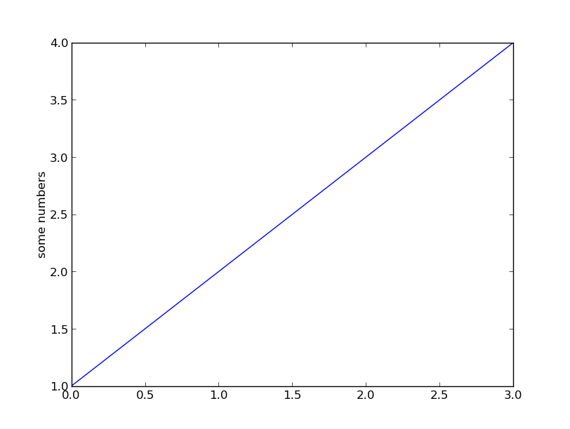
Wait, plot() makes a plot and returns a value?
Take note that plot() both generates the plot you asked for, and returns a list of line objects. This happens for most matplotlib plotting commands. They will generate the image, contours, histogram, or whatever you want, and also return an object that you can then use to later adjust the properties of the plotted object.
You may be wondering why the x-axis ranges from 0-3 and the y-axis from 1-4. If you provide a single list or array to the plot() command, matplotlib assumes it is a sequence of y values, and automatically generates the x values for you. Since python ranges start with 0, the default x vector has the same length as y but starts with 0. Hence the x data are [0, 1, 2, 3].
plot() is a versatile command, and will take an arbitrary number of arguments. For example, to plot x versus y, you can issue the command:
In [6]: plt.clf()    # this clears the existing figure

In [7]: plt.plot([1,2,3,4], [1,4,9,16])
 Out[7]: [<matplotlib.lines.Line2D at 0x10ce89910>]
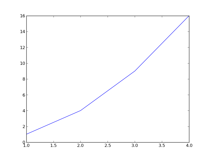
plot() is just the tip of the iceberg for plotting commands and you should study the page of matplotlib screenshots to get a better picture.
For every x, y pair of arguments, there is an optional third argument which is the format string that indicates the color and line type of the plot. The letters and symbols of the format string are copied from MATLAB, and you concatenate a color string with a line style string. The default format string is b-, which is a solid blue line. For example, to plot the above with red circles, you would issue:
In [8]: plt.clf()

In [9]: plt.plot([1,2,3,4], [1,4,9,16], 'ro')
 Out[9]: [<matplotlib.lines.Line2D at 0x10fc69790>]

In [10]: plt.axis([0, 6, 0, 20])
Out[10]: [0, 6, 0, 20]
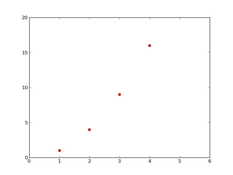
See the plot() documentation for a complete list of line styles and format strings. The axis() command in the example above takes a list of [xmin, xmax, ymin, ymax] and specifies the viewport of the axes.
Intermezzo: Introduction to numpy
This is a good opportunity to introduce NumPy.
If matplotlib were limited to working with lists, it would be of limited use for numeric processing. Generally, you will use NumPy arrays. In fact, all sequences are converted to numpy arrays internally.
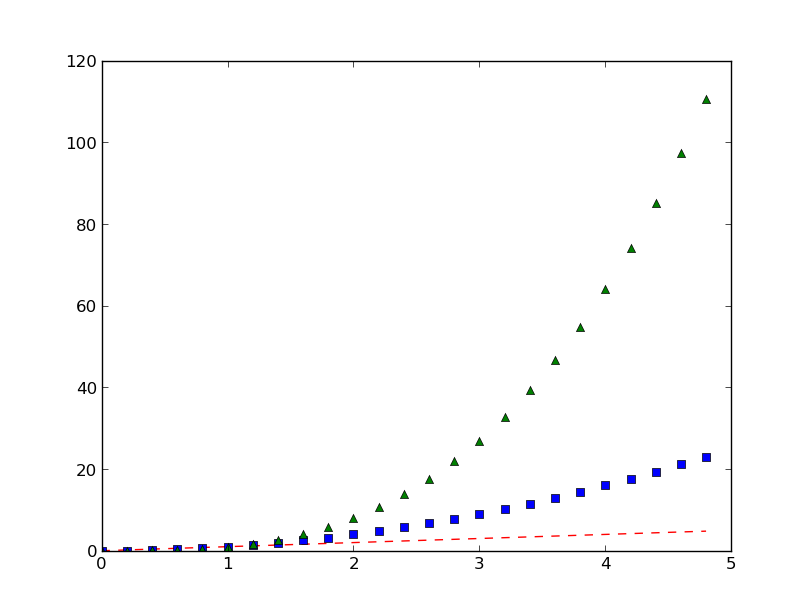
The example below illustrates plotting several lines with different format styles in one command using arrays (red dashes, blue squares, green triangles, cyan filled circles with connecting line):
In [11]: t = np.arange(0., 5., 0.2)

In [12]: plt.clf()

In [13]: plt.plot(t, t, 'r--', t, t**2, 'bs', t, t**3, 'g^')
Out[13]:
[<matplotlib.lines.Line2D at 0x10fc921d0>,
 <matplotlib.lines.Line2D at 0x10fc92690>,
 <matplotlib.lines.Line2D at 0x10fc92b90>]

In [14]: plt.plot(t, t+60, 'co-')
Out[14]: [<matplotlib.lines.Line2D at 0x10fc69990>]
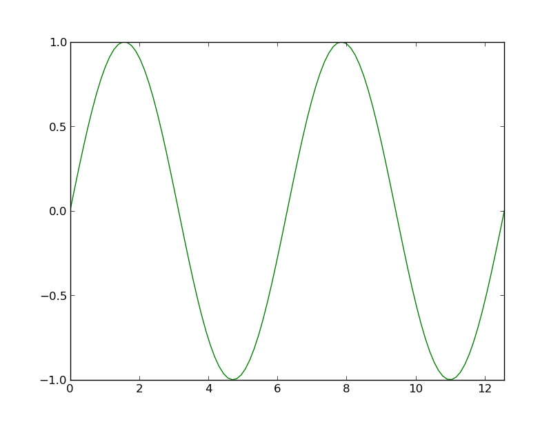
Exercise: Plot a sine curve
Make a plot of a sin curve between 0 and 4*pi shown by a green curve. Remember that the value of pi and the sine function are in the numpy namespace (np.pi and np.sin).
Click to Show/Hide Solution
In [15]: plt.clf()

In [16]: x = np.linspace(0, 4*np.pi, 100)

In [17]: plt.plot(x, np.sin(x), 'g')
Out[17]: [<matplotlib.lines.Line2D at 0x10f2da090>]

In [18]: plt.xlim(0, 4*np.pi)
Out[18]: (0, 12.566370614359172)

In [19]: plt.ylim(-1.1, 1.1)
Out[19]: (-1.1, 1.1)
What are lines and markers?
A matplotlib “line” is an object containing a set of points and various attributes describing how to draw those points. The points are optionally drawn with “markers” and the connections between points can be drawn with various styles of line (including no connecting line at all).
Lines have many attributes that you can set: linewidth, dash style, antialiased, etc; see Line2D. There are two commonly-used ways to set line properties:
Use keyword args:
In [20]: x = np.arange(0, 10, 0.25)

In [21]: y = np.sin(x)

In [22]: plt.clf()

In [23]: plt.plot(x, y, linewidth=4.0)
Out[23]: [<matplotlib.lines.Line2D at 0x10ed0d890>]
Use the setter methods of the Line2D instance. plot returns a list of lines; eg line1, line2 = plot(x1,y1,x2,x2). Below I have only one line so it is a list of length 1. I use tuple unpacking in the line, = plot(x, y, 'o') to get the first element of the list:
In [24]: plt.clf()

In [25]: line, = plt.plot(x, y, '-')
You can use tab completion to see the methods defined for line: For example, change the line color, noting that in this case you need to explicitly redraw:
In [26]: line.set_color('m') # change color

In [27]: plt.draw()
Here are some of the Line2D properties.
| Property | Value Type |
|---|---|
| alpha | a float that controls the opacity |
| antialiased or aa | [True | False] |
| color or c | any matplotlib color |
| dash_capstyle | [‘butt’ | ‘round’ | ‘projecting’] |
| dash_joinstyle | [‘miter’ | ‘round’ | ‘bevel’] |
| dashes | sequence of on/off ink in points |
| data | (array xdata, array ydata) |
| figure | The figure in which the plot was made |
| label | a string used for the legend (see below) |
| linestyle or ls | [ ‘-‘ | ‘–’ | ‘-.’ | ‘:’ | ‘steps’ | ...] |
| linewidth or lw | float value in points |
| lod | [True | False] |
| marker | [ ‘+’ | ‘,’ | ‘.’ | ‘1’ | ‘2’ | ‘3’ | ‘4’ | ... ] |
| markeredgecolor or mec | any matplotlib color |
| markeredgewidth or mew | float value in points |
| markerfacecolor or mfc | any matplotlib color |
| markersize or ms | float |
| markevery | None | integer | (startind, stride) |
| solid_capstyle | [‘butt’ | ‘round’ | ‘projecting’] |
| solid_joinstyle | [‘miter’ | ‘round’ | ‘bevel’] |
| visible | [True | False] |
| xdata | array |
| ydata | array |
| zorder | a number determining the plot order (controls overlaps) |
Exercise: Make this plot
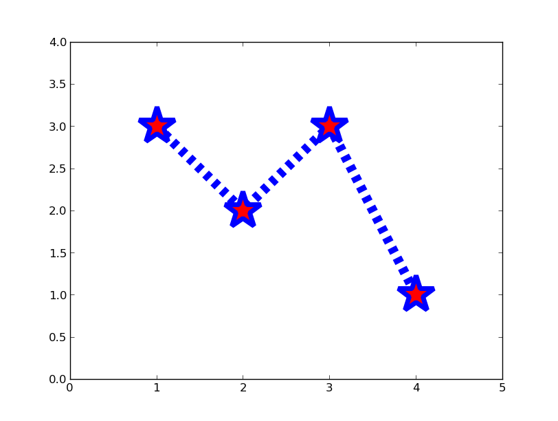
Make a plot that looks similar to the one above. You should be able to do this just by using the format string and keyword arguments to adjust the line and marker properties.
Click to Show/Hide Solution
In [28]: x = [1, 2, 3, 4]

In [29]: y = [3, 2, 3, 1]

In [30]: plt.clf()

In [31]: plt.plot(x,y,marker='*',linestyle='--',color='b',linewidth=10,markerfacecolor='r',markeredgecolor='b',markeredgewidth=5,markersize=40)
Out[31]: [<matplotlib.lines.Line2D at 0x10ed35050>]

In [32]: plt.xlim(0, 5)
Out[32]: (0, 5)

In [33]: plt.ylim(0, 4)
Out[33]: (0, 4)
There are more possibilities:
plot(x,y,'b*--',linewidth=10,markerfacecolor='r',markeredgecolor='b',markeredgewidth=5,markersize=40)
plot(x,y,'*--',color='b',linewidth=10,markerfacecolor='r',markeredgecolor='b',markeredgewidth=5,markersize=40)
Colors
Colors can be specified in an number of ways:
- via one of the following 7 abbreviations: b, g, r, c, m, y, k. This is also the default color cycle in matplotlib. That is, if you do not specify a color, the first object will be blue, the second green, then red, cyan, magenta, yellow and finally black. The next will be blue again, then green, red etc...
- via the name of a color, e.g. lightgoldenrodyellow...
- via a string of a float between 0 (black) and 1 (white), representing shades of gray.
- via an RGB tuple (1.0,0,1) (purple).
The behaviour of the color cycle can be shown with the following code, using the Bessel functions from scipy.special:
import scipy.special
x = np.linspace(0,15,100)
for i in range(10):
    plot(x,scipy.special.jv(i,x))
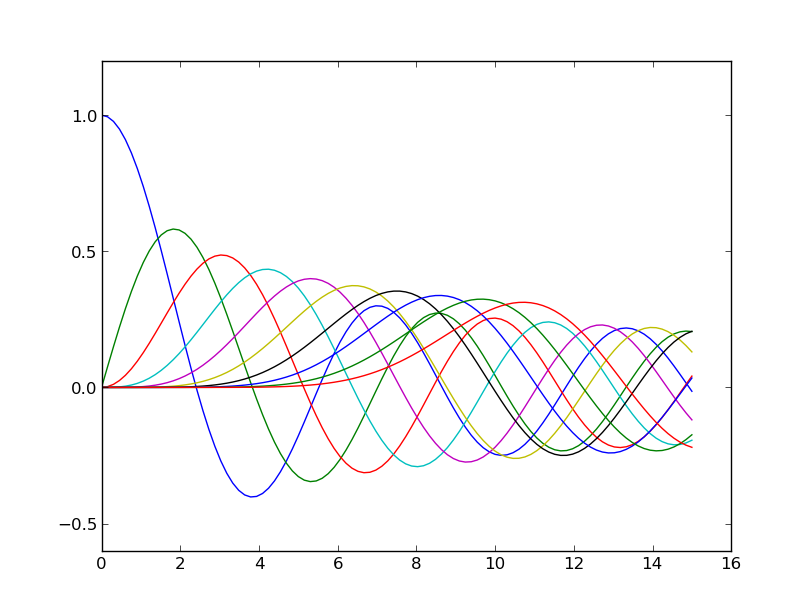
You can easily define a color cycle based on an existing colormap, and with the resolution you want. In the previous example, a color cycle of length 10 would be more useful:
import itertools
color_cycle = itertools.cycle(plt.cm.spectral(np.linspace(0,1,10)))
for i in range(10):
    plot(x,scipy.special.jv(i,x),color=color_cycle.next())
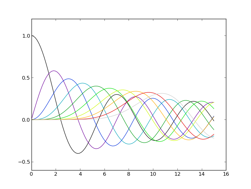
The use of the cycle method from the standard itertools package ensures that when we add a new object to plot, we start over in the color cycle.
Some useful functions for controlling plotting
Here are a few useful matplotlib.pyplot functions:
| figure() | Make new figure frame (accepts figsize=(width,height) in inches) |
| clf() | Clear an existing figure |
| axis() | Set plot axis limits or set aspect ratio (plus more) |
| subplots_adjust() | Adjust the spacing around subplots (fix clipped labels etc) |
| xlim(), ylim(), axis() | Set x and y axis limits |
| xticks(), yticks() | Set x and y axis ticks |
| savefig() | Save a figure as png, pdf, ps, svg, jpg, ... |
Working with multiple figures and axes
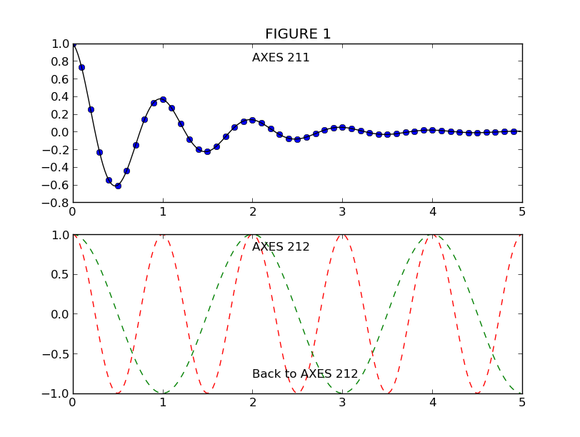
MATLAB, and matplotlib.pyplot, have the concept of the current figure and the current axes. All plotting commands apply to the current axes. The function gca() returns the current axes (a matplotlib.axes.Axes instance), and gcf() returns the current figure (matplotlib.figure.Figure instance). Normally, you don’t have to worry about this, because it is all taken care of behind the scenes. Below is a script to create two figures where the first figure has two subplots:
In [34]: def f(t):
....: """Python function to calculate a decaying sinusoid"""
....: val = np.exp(-t) * np.cos(2*np.pi*t)
....: return val
....:
In [35]: t1 = np.arange(0.0, 5.0, 0.1)
In [36]: t2 = np.arange(0.0, 5.0, 0.02)
In [37]: plt.figure(1) # Make the first figure
Out[37]: <matplotlib.figure.Figure at 0x109fba590>
In [38]: plt.clf()
In [39]: plt.subplot(211) # 2 rows, 1 column, plot 1
Out[39]: <matplotlib.axes.AxesSubplot at 0x10ed1bb90>
In [40]: plt.plot(t1, f(t1), 'bo', t2, f(t2), 'k')
Out[40]:
[<matplotlib.lines.Line2D at 0x1100ef990>,
<matplotlib.lines.Line2D at 0x1100efa10>]
In [41]: plt.title('FIGURE 1')
Out[41]: <matplotlib.text.Text at 0x10ed75750>
In [42]: plt.text(2, 0.8, 'AXES 211')
Out[42]: <matplotlib.text.Text at 0x10ed73a90>
In [43]: plt.subplot(212) # 2 rows, 1 column, plot 2
Out[43]: <matplotlib.axes.AxesSubplot at 0x1100ef910>
In [44]: plt.plot(t2, np.cos(2*np.pi*t2), 'r--')
Out[44]: [<matplotlib.lines.Line2D at 0x11010f550>]
In [45]: plt.text(2, 0.8, 'AXES 212')
Out[45]: <matplotlib.text.Text at 0x11010f410>
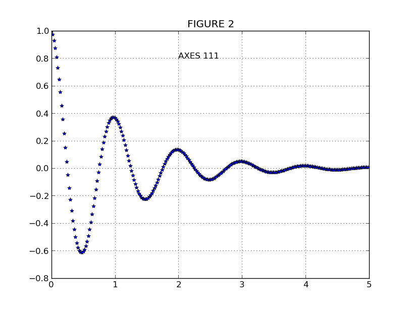
In [46]: plt.figure(2) # Make a second figure
Out[46]: <matplotlib.figure.Figure at 0x101fb3810>
In [47]: plt.clf()
In [48]: plt.plot(t2, f(t2), '*')
Out[48]: [<matplotlib.lines.Line2D at 0x1100ac310>]
In [49]: plt.grid()
In [50]: plt.title('FIGURE 2')
Out[50]: <matplotlib.text.Text at 0x1100f5bd0>
In [51]: plt.text(2, 0.8, 'AXES 111')
Out[51]: <matplotlib.text.Text at 0x1100ac950>
Now return the second plot in the first figure and update it:
In [52]: plt.figure(1)             # Select the existing first figure
Out[52]: <matplotlib.figure.Figure at 0x109fba590>

In [53]: plt.subplot(212)          # Select the existing subplot 212
Out[53]: <matplotlib.axes.AxesSubplot at 0x1100ef910>

In [54]: plt.plot(t2, np.cos(np.pi*t2), 'g--')   # Add a plot to the axes
Out[54]: [<matplotlib.lines.Line2D at 0x1100ac8d0>]

In [55]: plt.text(2, -0.8, 'Back to AXES 212')
Out[55]: <matplotlib.text.Text at 0x1100ef8d0>
|
|
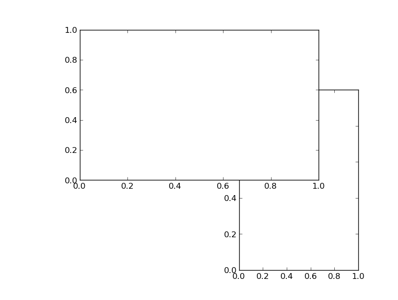
Finally, you can also create axes at random locations, fully controlling the height and width:
In [56]: plt.close('all') # close all previous plots

In [57]: plt.axes([0.6,0.1,0.30,0.6]) # left, bottom, width, height in figure fractions
Out[57]: <matplotlib.axes.Axes at 0x1100ac7d0>

In [58]: plt.axes([0.2,0.4,0.60,0.5])
Out[58]: <matplotlib.axes.Axes at 0x1100c40d0>
| subplots_adjust() | Adjust the spacing around subplots (fix clipped labels etc) |
| tight_layout() | Automatically adjust subplot parameters to give specified padding |
| subplot2grid() | Create a subplot in a grid |
| axes() | Add an axes to the figure |
Text, Histograms and Legends
Note: The following examples are not typed in IPython shell style anymore, to enhance readability. You can copy the text here and paste it in IPython typing ``%paste``
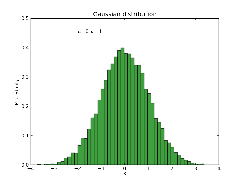
The text() command can be used to add text in an arbitrary location, and the xlabel(), ylabel() and title() are used to add text in the indicated locations (see the text intro for a more detailed example). Here we’ll create a histogram from some data using the hist() command and then annotate it with some text:
mu, sigma = 0, 1
x = np.random.normal(mu, sigma, size=10000)
plt.clf()

# the histogram of the data
histvals, binvals, patches = plt.hist(
   x, bins=50, normed=1, facecolor='g', alpha=0.75, label='my data')

plt.xlabel('x')
plt.ylabel('Probability')
plt.title('Gaussian distribution')
plt.text(-2, 0.45, r'$\mu=0,\ \sigma=1$') # the prefix are makes it a `raw` string, ensuring that e.g. `\n` is not converted to a return
plt.xlim(-4, 4)
plt.ylim(0, 0.5)
plt.grid(True)
All of the text() commands return a matplotlib.text.Text instance. Just as with with lines above, you can customize the properties by passing keyword arguments into the text functions or using set_ methods:
t = plt.xlabel('my data', fontsize=14, color='red')
These properties are covered in more detail in text-properties. For example, you can change the alignment of the text with respect to the coordinates with the verticalalignment and horizontal alignment (or va and ha) keywords:
plt.text(-2, 0.45, r'$\mu=0,\ \sigma=1$', ha='right', color='g')
We’ve also added an extra keyword label to the hist() call. This will be used to label the curve if we later decide to add a legend. Let’s do that now using legend():
plt.legend(loc='best')
Type plt.legend? and take a look at the different keyword options that let you customise the legend. loc=’best’ means it will magically choose a location to minimise overlap with the plotted data. A nice trick with the legend is that you can make it semi-transparant, so that you can still see underlying data:
plt.legend(loc='best').get_frame().set_alpha(0.5)
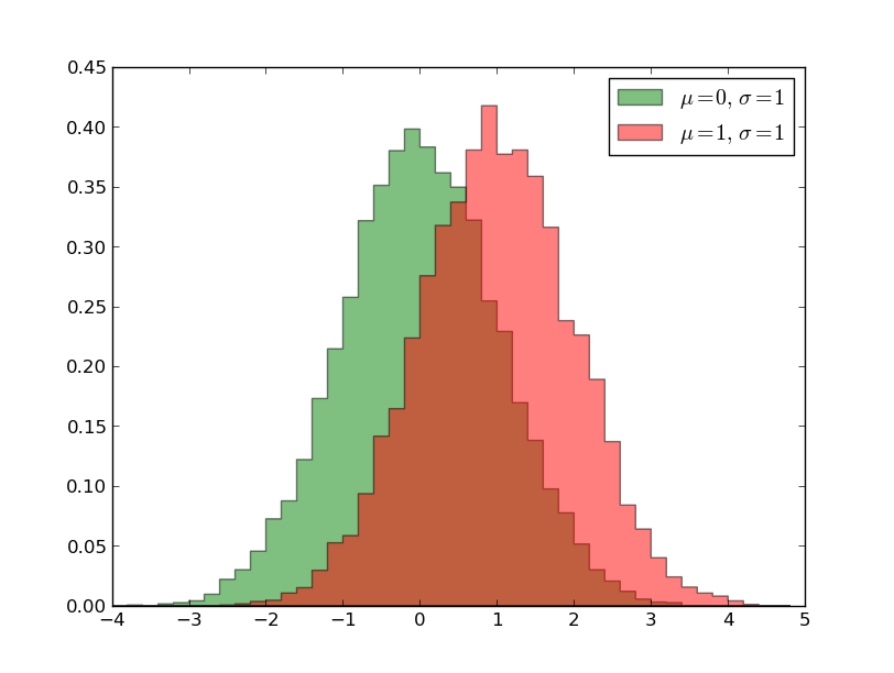
Click to Show/Hide Solution
plt.clf()
x2 = np.random.normal(1, 1, size=10000)
bins = np.arange(-4, 5, 0.2)
out = plt.hist(x, bins=bins, normed=1, facecolor='g', alpha=0.5,
              histtype='stepfilled', label=r'$\mu=0,\ \sigma=1$')
out = plt.hist(x2, bins=bins, normed=1, facecolor='r', alpha=0.5,
              histtype='stepfilled', label=r'$\mu=1,\ \sigma=1$')
plt.legend(loc='best')
Using mathematical expressions in text
matplotlib accepts TeX equation expressions in any text expression. For example, to write the expression \sigma_i=15 in the title you can write a TeX expression surrounded by dollar signs:
plt.title(r'$\sigma_i=15$')
The r preceeding the title string is important – it signifies that the string is a raw string and not to treate backslashes as python escapes. matplotlib has a built-in TeX expression parser and layout engine, and ships its own math fonts – for details see the mathtext-tutorial. Thus you can use mathematical text across platforms without requiring a TeX installation. For those who have LaTeX and dvipng installed, you can also use LaTeX to format your text and incorporate the output directly into your display figures or saved postscript – see the usetex-tutorial.
Annotating text
The uses of the basic text() command above place text at an arbitrary position on the Axes. A common use case of text is to annotate some feature of the plot, and the annotate() method provides helper functionality to make annotations easy. In an annotation, there are two points to consider: the location being annotated represented by the argument xy and the location of the text xytext. Both of these arguments are (x,y) tuples:
plt.clf()
t = np.arange(0.0, 5.0, 0.01)
s = np.cos(2*pi*t)
lines = plt.plot(t, s, lw=2)

plt.annotate('Local maximum', xy=(2, 1), xytext=(3, 1.5),
         arrowprops=dict(facecolor='black', shrink=0.05, width=2))
plt.ylim(-2,2)
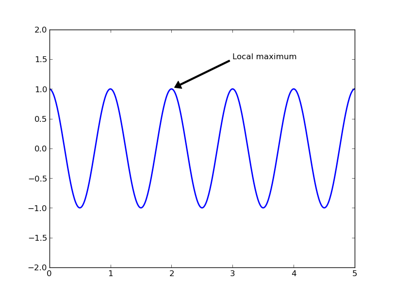
In this basic example, both the xy (arrow tip) and xytext locations (text location) are in data coordinates. There are a variety of other coordinate systems one can choose – see the annotations tutorial. More examples can be found here
Plotting 2-d data
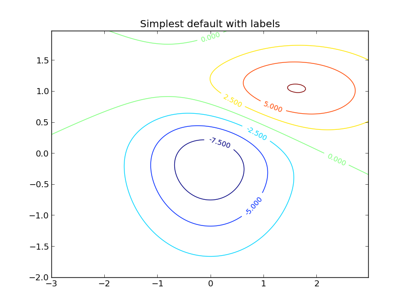
Making contour plots and saving figures
Contour plots can be made using the contour() command, and they can then be labelled with clabel():
def gaussian_2d(x, y, x0, y0, xsig, ysig):
    return np.exp(-0.5*(((x-x0) / xsig)**2 + ((y-y0) / ysig)**2))

delta = 0.025
x = np.arange(-3.0, 3.0, delta)
y = np.arange(-2.0, 2.0, delta)
X, Y = np.meshgrid(x, y)
Z1 = gaussian_2d(X, Y, 0., 0., 1., 1.)
Z2 = gaussian_2d(X, Y, 1., 1., 1.5, 0.5)
# difference of Gaussians
Z = 10.0 * (Z2 - Z1)

# Create a contour plot with labels using default colors.  The
# inline argument to clabel will control whether the labels are draw
# over the line segments of the contour, removing the lines beneath
# the label
plt.clf()
CS = plt.contour(X, Y, Z)
plt.clabel(CS, inline=1, fontsize=10)
plt.title('Simplest default with labels')
Once you’ve made plots, they can be saved with savefig. They can be saved as jpg, png, pdf, ps, svg and other formats; the format is inferred from the suffix of the filename:
plt.savefig('contour.pdf')
png format is generally best for putting in talks. For papers and posters it’s better to use a vector format like ps, pdf or svg. There can be small differences between the plot you see on the screen and a saved pdf or ps version, so check the saved version looks as you expect. Often the saved vector format version will look better! However, plotting a large number of datapoints often results in a huge filesize. A possible workaround might be plotting while adding the rasterize=True option. If this does not help, a way out might be to save it to a png file and embed the bitmap in a eps file afterwards. This destroys the purpose of a vector format, but some journals require plots in eps format and with a small file size.
You can also save a plot using the button in the plotting window.
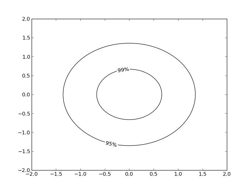
Exercise: Make a contour plot
Make a contour plot of a single 2d gaussian centred on 0,0. You should show only 2 contours that are both coloured black. Label the inner contour with ‘99%’ and the outer contour with ‘95%’. You might want to take a look at the fmt keyword in the help for clabel() to see how to give your own contour labels, and take note that the values of each contour level are stored in CS.levels.
Click to Show/Hide Solution
x = np.linspace(-2.0, 2.0)
y = np.linspace(-2.0, 2.0)
X, Y = np.meshgrid(x, y)
Z = gaussian_2d(X, Y, 0, 0, 1., 1.)

plt.figure()
CS = plt.contour(X, Y, Z, 2, colors='k')
fmt = {CS.levels[0]: '95%', CS.levels[1]: '99%'}
plt.clabel(CS, fmt=fmt)
Images
You can easily plot 2D data as an image. For this example, we’re gonna download an image from the DSS survey, to make a simple finderchart. We need the standard library urllib to download the image and the extension pyfits to read the image:
import urllib
import pyfits

def get_image(ra,dec,width=5):
    """Download an image from DSS"""
    url  = urllib.URLopener()
    myurl = "http://archive.stsci.edu/cgi-bin/dss_search?ra=%s&dec=%s&equinox=J2000&height=%s&generation=%s&width=%s&format=FITS"%(ra,dec,width,'2i',width)
    out = url.retrieve(myurl)
    data = pyfits.getdata(out[0])
    url.close()
    return data

data = get_image('19:17:14.80316','+01:03:33.9006',width=5)
plt.subplot(111,aspect='equal')
plt.imshow(data[::-1],cmap=plt.cm.Greys,extent=[-2.5,2.5,-2.5,2.5])
plt.colorbar()
Other 2-d plots
A deeper tutorial on plotting 2-d image data will have to wait for another day:
- To plot images take a look at at the image tutorial
- `APLpy`_ allows you to easily make publication quality images for astronomical fits images incorporating WCS information.
Plotting 3-d data
Matplotlib supports plotting 3-d data through the mpl_toolkits.mplot3d module. Let’s take a look at an example of the 3-d viewer that is available:
from mpl_toolkits.mplot3d import Axes3D
import numpy as np
import matplotlib.pyplot as plt

def gaussian_2d(x, y):
    return np.exp(-0.5*(x**2 + y**2))

fig = plt.figure()
ax = fig.add_subplot(111, projection='3d')
vals = np.linspace(-3, 3)
x,y = np.meshgrid(vals, vals)
z = gaussian_2d(x, y)
ax.plot_wireframe(x, y, z, color='0.3', lw=0.5)
ax.set_xlabel('X')
ax.set_ylabel('Y')
ax.set_zlabel('Z')
To get more information check out the mplot3d tutorial.
If you want a better developed interactive 3D viewer, you might want to consider mayavi. It is designed to have a very familiar look and feel for matplotlib users.
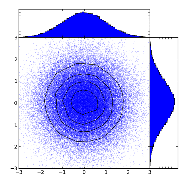
Putting it all together
Let’s use some of what we’ve learned over the past few lessons to plot a 2d distribution, overlay some contours, and show the 1d histograms corresponding to each dimension. You should understand everything that’s going on here - if you don’t, please ask!:
# the random data
x = np.random.randn(1e5)
y = np.random.randn(1e5)

# start with a rectangular figure
plt.figure(figsize=(6, 6))

# define the axes positions
left = bottom = 0.1
width = height = 0.7

ax_main = plt.axes([left, bottom, width, height])
ax_top = plt.axes([left, bottom + height, width, 0.15])
ax_right = plt.axes([left + width, bottom, 0.15, height])

# plot the data points
ax_main.plot(x, y, '.', markersize=0.5)

# now let's overplot some contours. First we have to make a 2d
# histogram of the point distribution.
vals, xedges, yedges = np.histogram2d(x, y, bins=30)

# Now we have the bin edges, but we want to find the bin centres to
# plot the contour positions - they're half way between the edges:
xbins = 0.5 * (xedges[:-1] + xedges[1:])
ybins = 0.5 * (yedges[:-1] + yedges[1:])

# now plot the contours
ax_main.contour(xbins, ybins, vals.T, 4, colors='k', zorder=10)

# finally plot 1d histograms for the top and right axes.
bins = np.arange(-3, 3.1, 0.1)
ax_top.hist(x, bins=bins, histtype='stepfilled')
ax_right.hist(y, bins=bins, orientation='horizontal', histtype='stepfilled')

# make all the limits consistent
ax_top.set_xlim(-3, 3)
ax_right.set_ylim(-3, 3)
ax_main.set_xlim(-3, 3)
ax_main.set_ylim(-3, 3)

# remove the tick labels for the top and right axes.
ax_top.set_xticklabels([])
ax_top.set_yticklabels([])
ax_right.set_xticklabels([])
ax_right.set_yticklabels([])

plt.draw()